With Region charts you can create visualizations such as the red state/blue state maps showing political election results, market share by country, or personal income by zip codes.
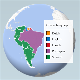
A Regions chart will show any of the following regions in your data:
-
Country
-
State/Province
-
County
-
Zip Code/Postal Code
-
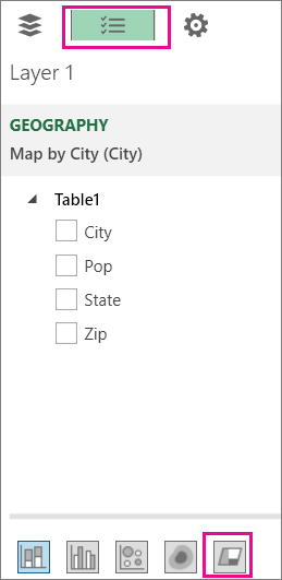
If you don’t see the Layer Pane, click Home >Layer Pane.

-
On the Field List tab, click Change the visualization to Region.